Whiteleys (Half) Entrance. When walking towards the entrance the public understands that it is not private as there are no barriers, or anything blocking the public from going in. The three entrances give it a more bigger (palace like) look and allow the flow of people coming in and out to stay steady, without interfearence. The big 'W' whiteleys sign also works as a welcome sign to everyone.
Left side view after road crossing, focusing in between the 2 sets of pillars
Focusing in the middle entrance from the right side.
Taking a look at the open public area before entering inside. Focusing on the space
and materials. Also I find the two statues quite interesting and I've never noticed them before.
Right side of the entrance there is a small hall with a lift.
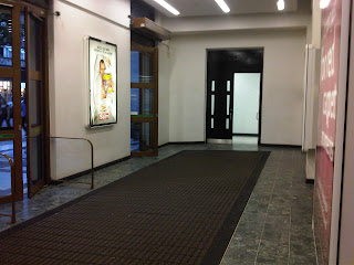
I also noticed the changes of the rough and stony material outside to a more soft and shining material used inside. There are also big matts at the entrance which give it a more internal look just like people's homes.
Open space after entering the building and feeling comfortable and warm. Door at the end is for staff.
When entering you first get a small picture of the building but a few steps after you get a full
view and notice how big this building's main entrance actually is.
Open space with patterned flooring. 3 door entrance into the shoppin centre
A lot of movement in this area from all sides of the building.
When coming in turn to the right, you'll notice this side of the building with all the stores.
I realised that the small cafe divisions in the middle allow people to walk in a certain flow
and not be disturbed by someone coming the wrong way because it is spacious
and passers by normally stick to the left side.
When entering the building if you look to your left you'll see the same number of stores on this side
and shops in the middle. There is also a ramp for disabled people, which is pathway used by everybody.
This is looking into the entrance but from a longer distance. You will notice the small step into this circular zone with a bit of the main Whiteleys double stairs showing.
Left side stair from where I am facing.
Right side stair from where I am facing. Both stairways are exactly similar, and have a great amount of
detail on them. They are black and made of iron and marble.
This type of stairway normally gives a building a very grand look.
A look from the entrance at the stairs which lead to the first floor. This idea
really gave this open space a grand and posh look and allows easier access upstairs.
When crowded there is no traffic since people going down and up always use the left side.
One side of this big circular space
Another part of the circular space. (1st and second floor only)
Another side (Ground floor and 1st floor) 2 pillars on every side to give it that palace look
and hold the structure of this building together from the centre.
The hallway to the left. There is another circular space like this a bit further but not with an entrance.
The reaso why I chose this area it's because it is the heart of this building and where main
important events take place. You can also view the beauty of the shopping centre through here.
Looking up from ground floor. The floors in this part of the building are symmetrical
and have the same shape as shown throughout the open roundabout of the building.
The glass at the top allows a natural great amount of light source inside.
You can also see that this building has 3 floors and a ground floor in this picture.
Another view in the same area looking up...
As you can see the pattern of the round space is the same throughout. A small balcony surrounded by 2 pillars all round.


No comments:
Post a Comment